- Scope:
Branding
Responsive website
Animations
Micro interactions - Role:
UX/UI designer
- Scope:
- Founded in 2020, NAHM is a prospective experimental Museum dedicated to non-animal organisms and their history. It focuses on interactions between lifeforms and aims to raise awareness about Earth's interconnected ecosystem. It intends to fill the gap between Botanical Gardens and Natural History Museums.


How might we bring together the idea of Natural History Museums and the experience of Botanical Gardens?
My Process

01 Research
- Due to the NHAM hybrid positioning between Natural History Museums and Botanical Gardens, we concentrate secondary research on indirect competitors. Natural History Museums are among the most visited worldwide and focus on animals, but other life forms are underrepresented. Botanical Gardens on the other hand, focus on plants, but their history has little explanation.
- We decided to target both experts and visitors. Therefore, we conducted interviews with individuals with a background in natural science and prospective museum users to understand market trends and assess the best tone of voice. From the interviews emerged:
If plants die, we will all die. And even if we can survive, it will be a terrible world.
Alessia
02 Empathize
From the research phase, a persona emerged. Empathizing with the target is essential in any UX process, allowing the design to be grounded in real motivation and needs.

03 Define
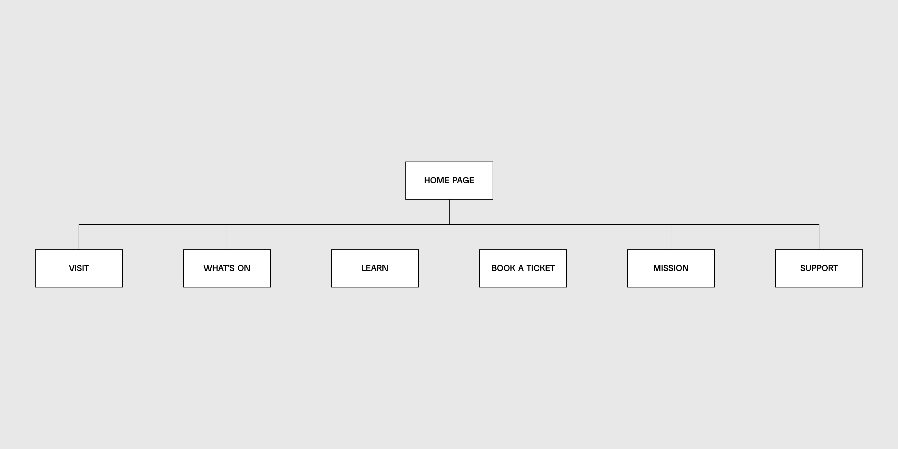
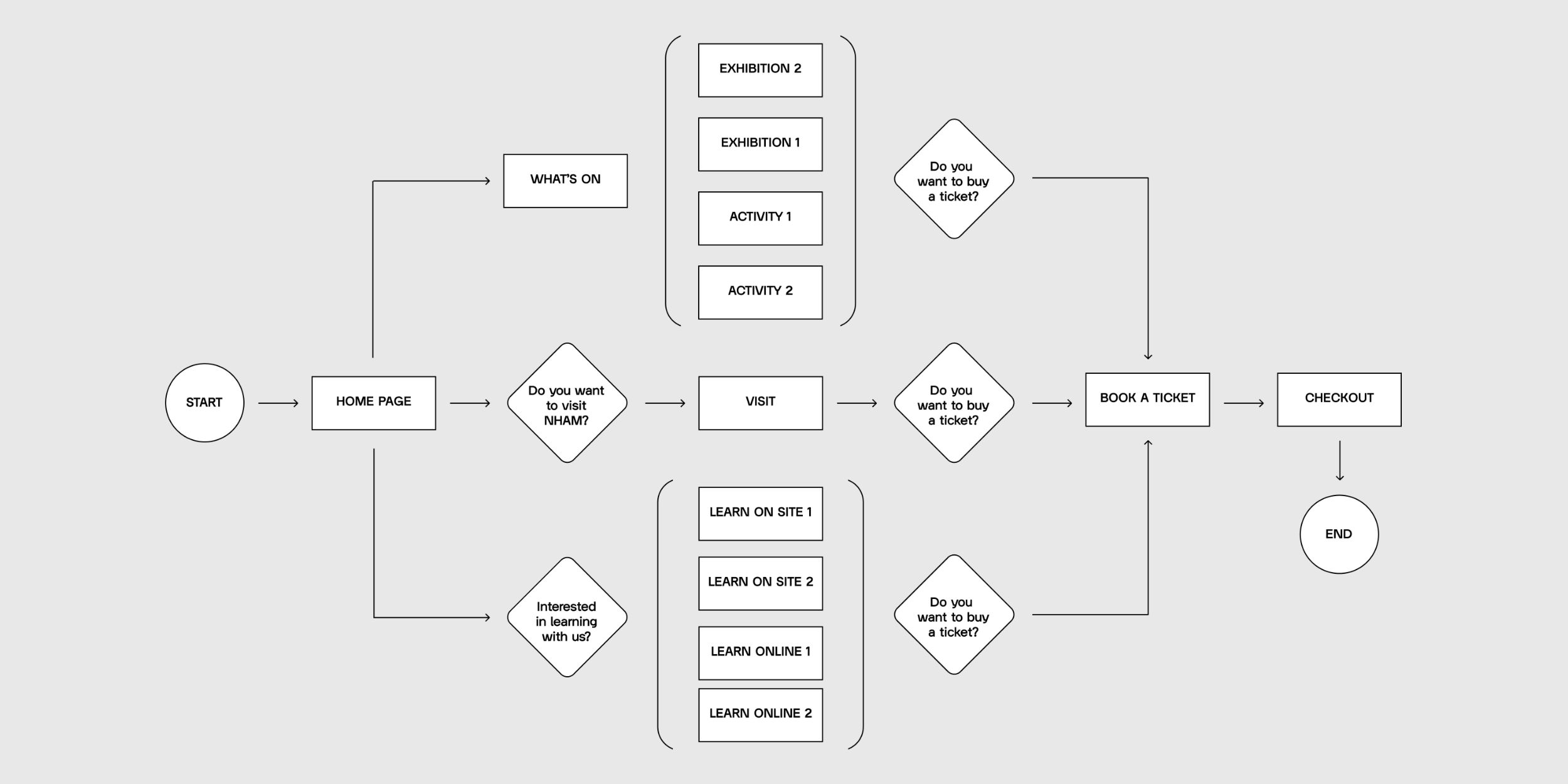
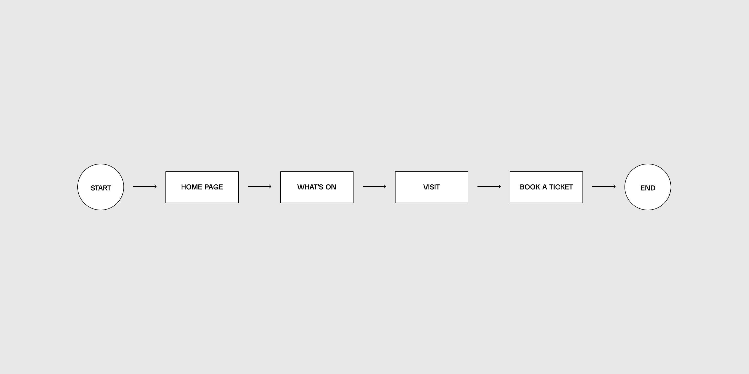
Before starting to design the app, we first explored the information architecture—how the content is hierarchically organized. Then we considered the flaws users follow while navigating the website.
04 Design
We started to develop the branding focusing on the idea of non-animal life forms. In this sense, the color palette includes two secondary colors, blue and yellow, which combined give green, the most common color amongst non-animal life forms.
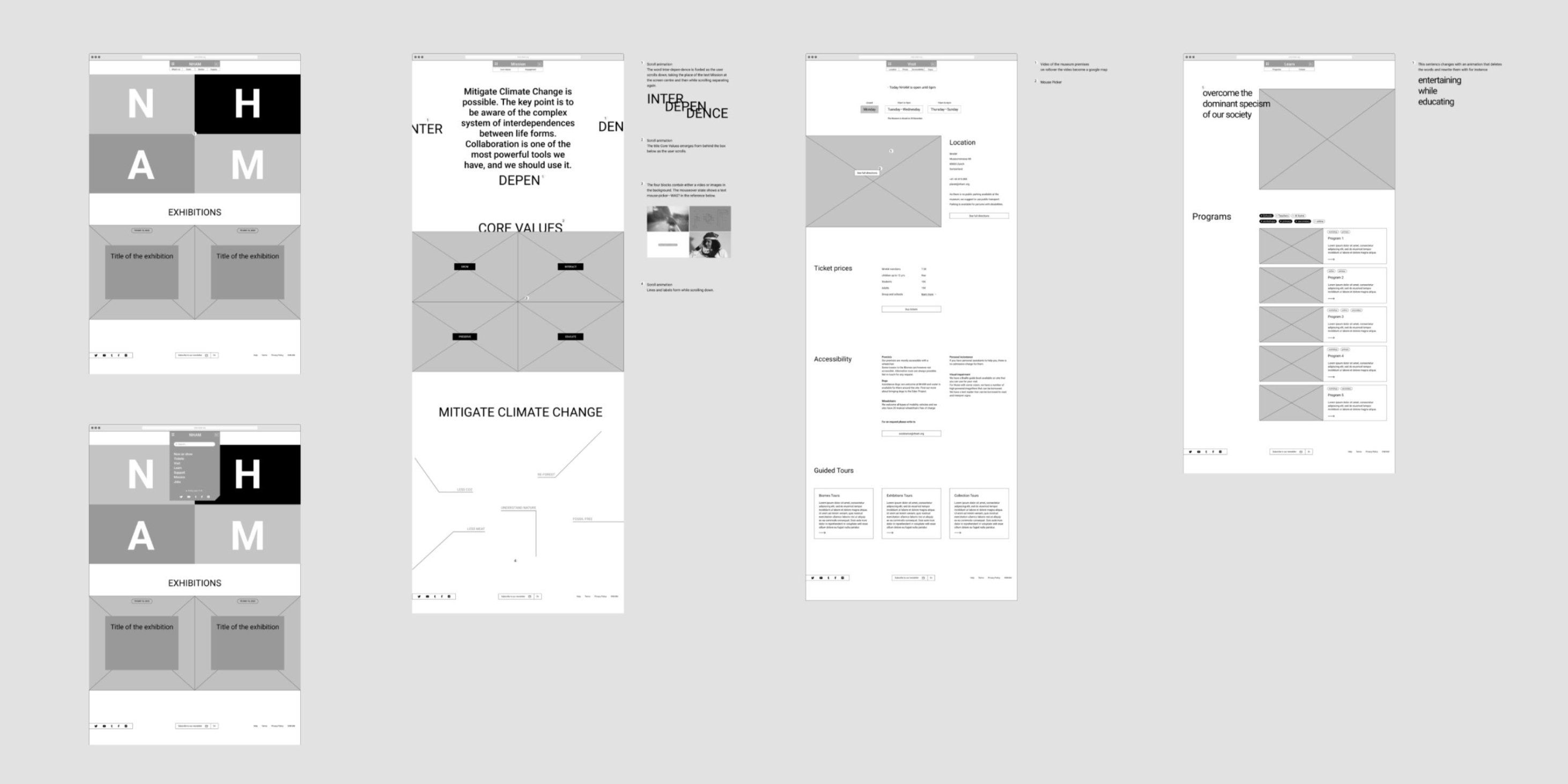
- We finally created a high-fidelity prototype—a close simulation of the website that can be navigated and experienced almost as an actual website.
- prototype
- The website is fully responsive, which means it adapts to a variety of devices and window or screen sizes to ensure usability and satisfaction. Mobile, tablet and desktop all have their specificities while they keep consistency.

- Micro-interactions
- We finally created a high-fidelity prototype—a close simulation of the website that can be navigated and experienced almost as an actual website.
- prototype
05 Usability test
The prototype has been tested by a group of potential users and experts. We made all necessary modifications to reach a mature phase, ready for the handover with developers.
