- Scope:
Re-design
Micro interactions - Role:
UX/UI designer
- Scope:
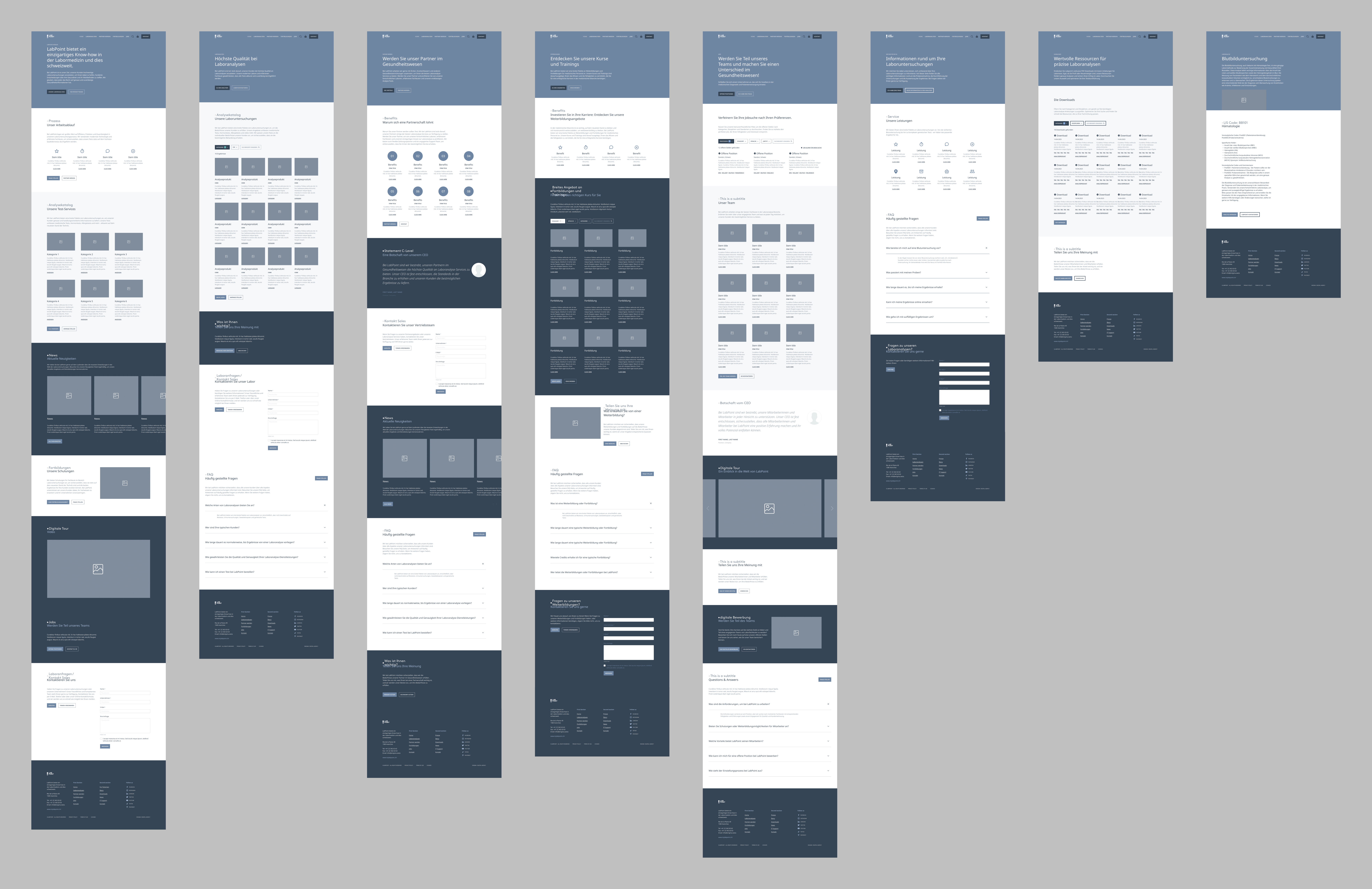
- This case study features the redesign of LabPoint Medical Laboratories AG, a leading provider of first-class laboratory diagnostics and advanced technical solutions based in Switzerland. The project aimed to create a modern and aesthetically pleasing website that combines simplicity and usability with the latest advancements in technology.
How might we blend advanced tech with simplicity? The path to a streamlined, innovative Medical Lab website.

Branding
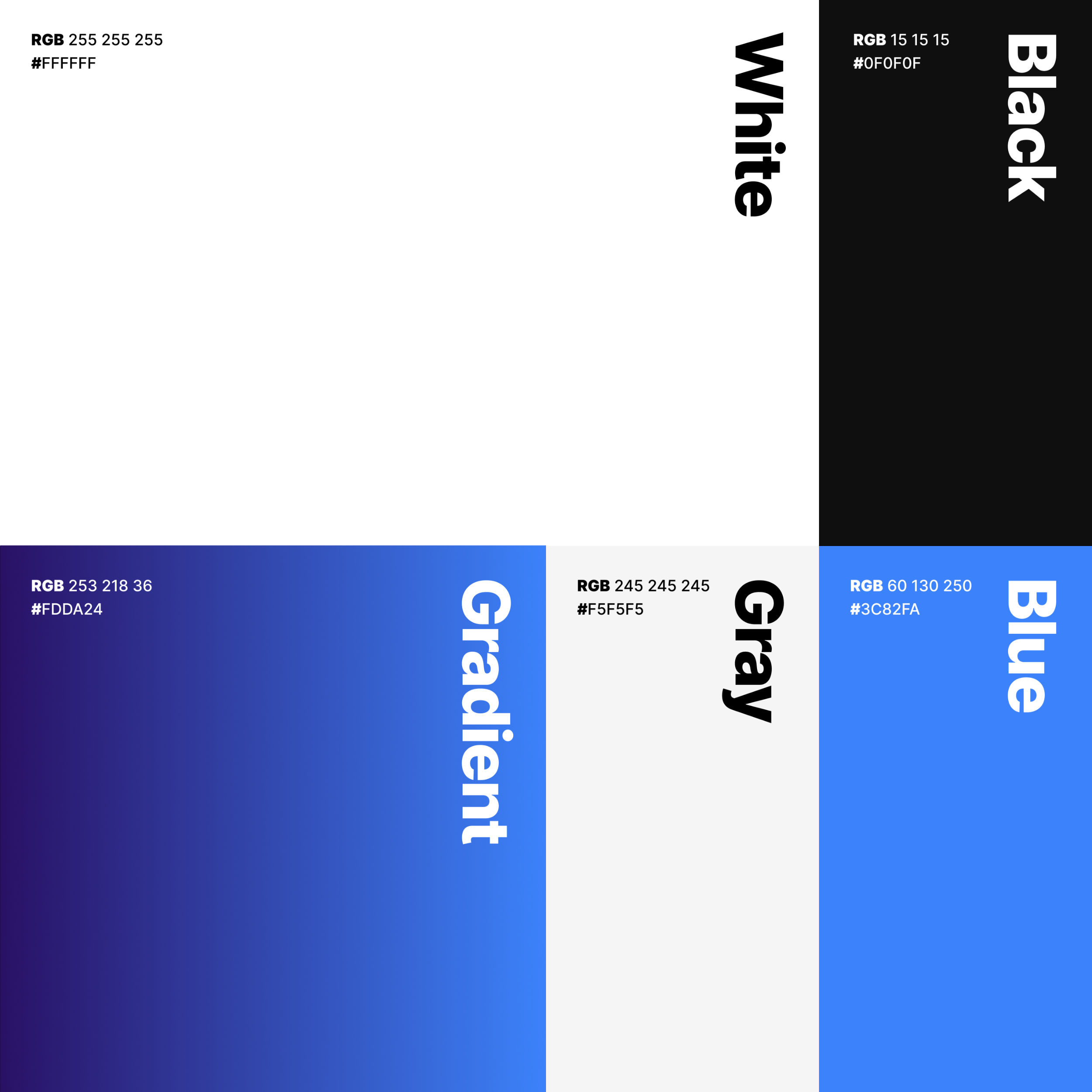
Inspired by the original design, the refreshed identity of Labpoint embraces a minimalist style, featuring a gradient color palette that transitions from light to dark blue. The aesthetic combines a calming and reassuring quality with a modern and sleek appearance, complemented by sleek Grotesk typography for a contemporary and comforting feel.
Micro-interactions
Special attention has been given to micro-interactions to highlight features and simplify the user experience. The contact page boasts effortless navigation, thanks to intuitive mouse feedback and clever layout design. Meanwhile, the Catalog page offers seamless exploration with navigation options optimized for mouse interaction.
Responsive Design
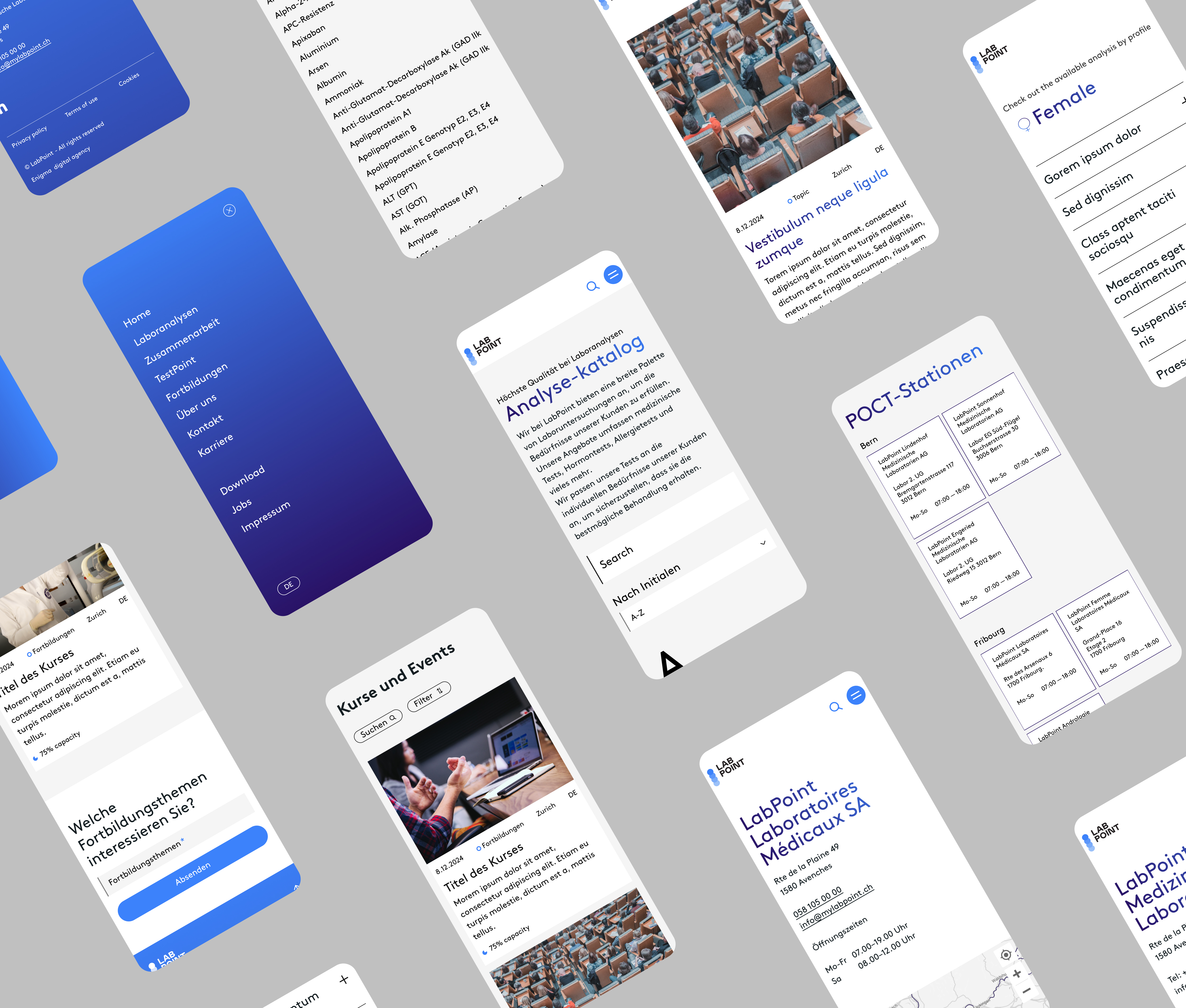
Employing responsive design principles, the website ensures a perfectly balanced mobile user experience, with easily readable headlines. A contrast-rich color palette enhances legibility, while the size of the headlines is optimized for effortless access, further enhancing the user experience with clarity and ease of navigation.


